LOADING
00
Branding

Lietuvos Triatlono Federacija

Client Lietuvos Triatlono Federacija
Year 2020
Type Branding
Lithuanian Triathlon federation was established in 1987 and from then on, each year they are organizing Lithuanian championships and triathlon cup competitions.
Single Image
Single Image
ABOUT THE PROJECT

When participating in the Lithuanian Triathlon logo competition, the visual system was inspired by the 3 stage event and the natural beauty surrounding the race.

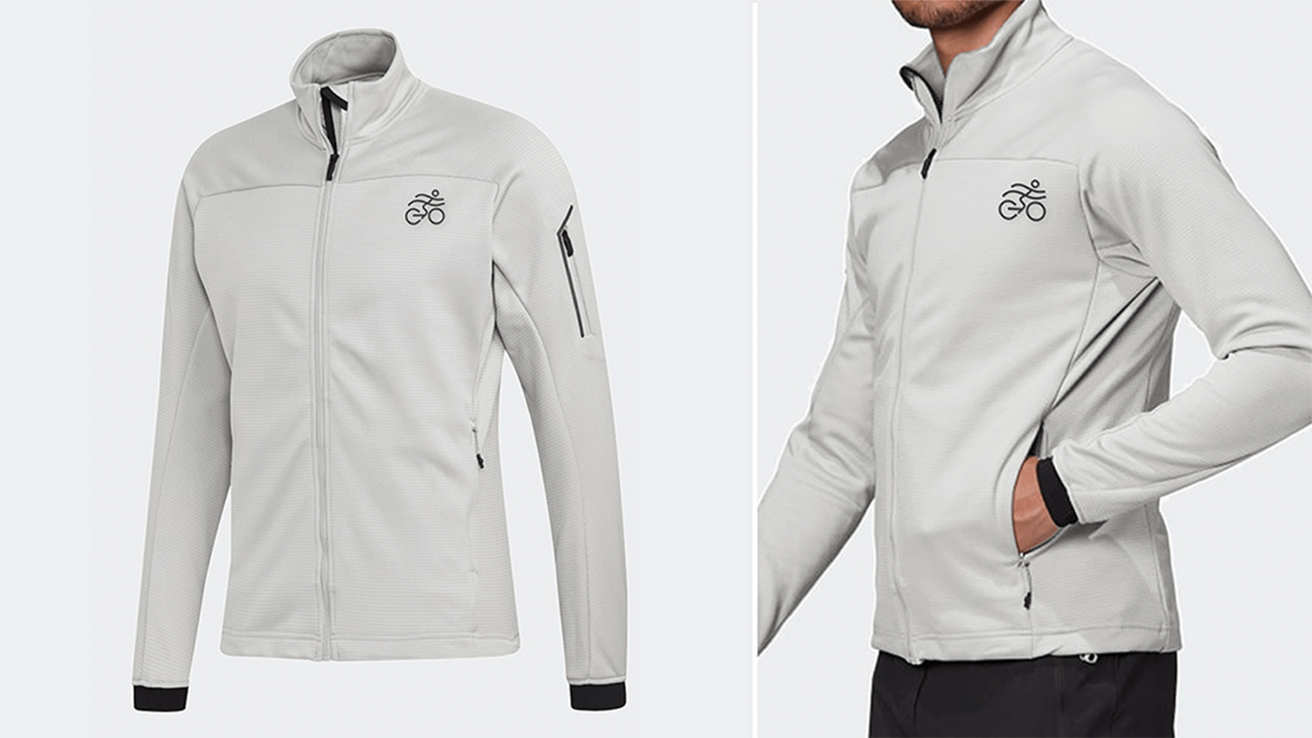
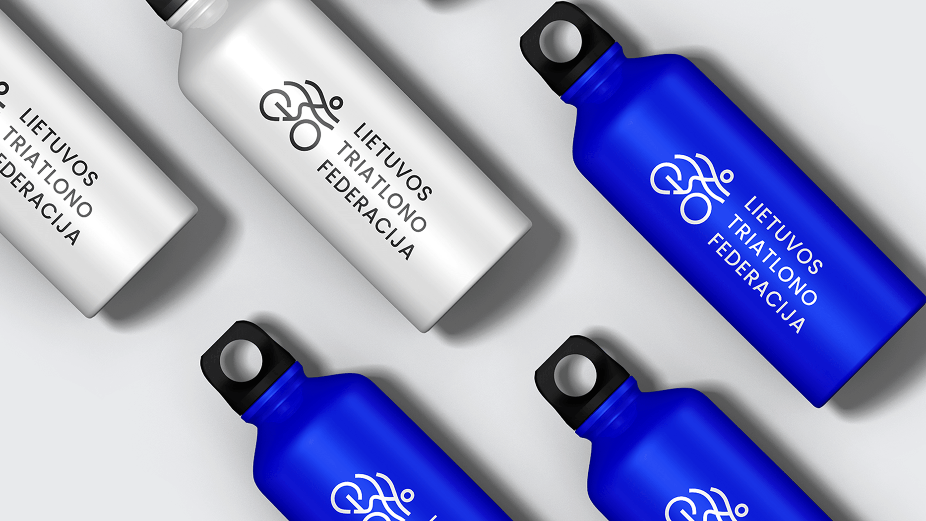
The dynamic and transmitting movements‘ symbol combines every part of the competition: swimming, cycling and running. The font used - Futura – is unique in the way that only essential details are depicted in the design, and unnecessary elements are discarded which in turn creates a versatile, distinctive and seamless style. 
Single Image
Single Image
Single Image
The approach

The approach

The different lines and one circle shape were used to create the logotype for Lithuanian Triathlon Federation. The simple and modern design of the logo is easily adaptable to different visual identities and communication materials which could be used to represent Triathlon federation of Lithuania. As well, it is easily recognizable and related to the brand, therefore, it would stand out from others and be memorized immediately by different people. The logotype can be used both with the full name of the federation or alone as an icon.